Windows 11: A Few More Observations
- Paul Thurrott
- Jun 15, 2021
-
68

When Windows 11 leaked earlier today, I did what any self-respecting technology enthusiast would do: I installed it on the PC I use every single day. But once that was complete, I needed to try a few other installs: Another upgrade, this time on an Evo-class laptop, and a clean install in a virtual machine. Both installs have been, in their own ways, instructive. And they’re not even done yet.
That’s because every Windows 11 install I’ve done so far has been quite time-consuming. In each case, once the PC reboots (or, on the clean install, simply goes off to do its thing), the UI “disappears” for many long minutes at a time, leaving only a blank black screen. And in both cases, the install UI is mostly unchanged from the previous several Windows versions.
Windows Intelligence In Your Inbox
Sign up for our new free newsletter to get three time-saving tips each Friday — and get free copies of Paul Thurrott's Windows 11 and Windows 10 Field Guides (normally $9.99) as a special welcome gift!
"*" indicates required fields
The clean install UI dates back to at least Windows Vista, though the purple color scheme debuted in Windows 8 (if I remember correctly).

And the upgrade UI, which resembles that of the Windows 10 Upgrade Assistant, most likely has its roots in Windows 8.

That said, when you get to the interactive portion of a clean install, the UI is new.
As a side note of sorts, the unexpected arrival of Windows 11 has thrown a wrench into my trip plans; as you may recall, I’m heading to Mexico City on Thursday and will be gone through next Tuesday. Originally, I was planning to bring the Windows 10 on ARM-based HP Elite Folio, since that’s the next non-Chromebook in line for review. But now I’m considering bringing a Windows 11-based PC so I can keep using this new system. We’ll see.
Overall, what we see here is what I’d call the bare minimum for a major version upgrade, as it provides a reasonable UI change, at least to all the modern UIs in Windows, and it will obviously include bundled apps updates as well, though we can’t see a single new or upgraded app in this build. As noted previously, I’m OK with that. But I’m still hoping Microsoft has some surprises in store for us next week.
A few more observations…
You can move the Start button and taskbar icons to the left. I like and prefer the centered Start button and taskbar icons, but I know some won’t. To put that all back where it was before, right-click the taskbar, choose Taskbar settings, and check out the new first option, “Taskbar alignment.”
Start search is broken. In previous Windows versions, you can tap Start and start typing to search. In Windows 11, you can tap Start and start typing but nothing happens. Instead, you have to open Search (WINKEY + S). I feel like having this all be one UI makes more sense.
There’s some fun Snap help. Snap works exactly as before and supports the same keyboard shortcuts. But if you mouse over the Maximize window button on any window, you’ll see a pop-up that visually shows you which Snap configurations you can use. Nice.

Most interactions are completely unchanged. For Windows 11 to make any sense at all, it needs to work as people expect and it needs to be compatible with all the apps people use, and so it needs to basically just be Windows 10.1. And it is. This isn’t a huge problem, but I know some will complain that Microsoft isn’t touching legacy UIs as hoped, and Windows 11 isn’t a clean break—or any break, really, with the past.
Screenshots are broken. I think. When you type WINKEY + PRINTSCREEN, the screen flashes like it’s taking a screenshot, but no screenshot is saved in the normal location. It’s possible that they’re saved somewhere else and I’ve just not figured that out yet.
Lots of things are missing. Lots of little but familiar UIs are missing in this release. For example, Jump lists are gone from Start icons. And I noted above that you can right-click the taskbar and choose an option, but that’s the only option now. In Windows 10, there are several more items in that menu, many related to what appears in the taskbar, but also links to run things like Task Manager and show the desktop. Not in Windows 11.
Lots of things are broken. Some missing interactions seem like bugs. For example, I often drag an image file over to the Affinity Photo icon in my taskbar and the app pops up so I can drog the file in it and start editing. This is broken in Windows 10, at least for now. So I have to start a file drag with the mouse and then Alt + Tab with the keyboard to open the app and then drop the file in it.
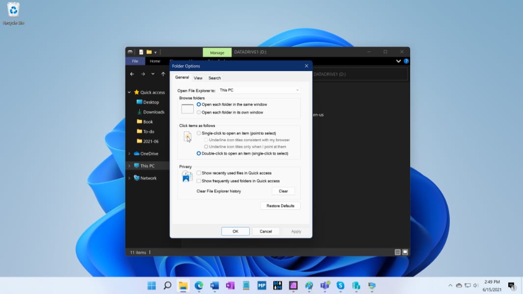
Oh, (in)consistency. Window enthusiasts have been looking for a more consistent UI for years. But the new look/feel in Windows 11, at least in this build, only extends to the Windows 10 UIs. So the other stuff—Control Panel, MMC, etc.—still looks old-fashioned and inconsistent. But the problem is not just that legacy UIs that most people will never see have been untouched: Some common UIs are still inconsistent. For example, when you use File Explorer in Dark mode and then open the Folder Options window, it appears in bright white. This is the kind of thing that drives people like me nuts.
I’ll report back if the clean install reveals anything unique.